RM to 5.0
Roadmap to 5.0 project aimed to create a cohesive visual identity for the book launch of David Akanmu, a valedictorian who achieved a perfect 5.0 CGPA.
The "Roadmap to 5.0" project celebrated David Akanmu’s academic excellence, with our team creating branding that highlighted the book launch's significance and appealed to both academic and professional audiences.
Insights
The project began with a deep understanding of the client’s vision. David Akanmu, the author, aimed to create branding that embodied academic excellence, inspiration, and strategic guidance for students. The book launch was positioned as an exclusive event designed to captivate students, educators, and industry professionals, leaving a lasting impression of success and motivation.
To ensure the branding resonated with the target audience, we conducted a comprehensive analysis of their needs and expectations. The primary focus was on university students, educators, and professionals who value academic achievement and holistic growth. Our design approach prioritized sophistication, clarity, and inspiration to align with these groups.
Additionally, we performed competitor benchmarking by examining similar academic and motivational book launches. This allowed us to identify industry best practices while crafting a distinct and impactful visual identity that stood out from the rest.
Concept Development
The next step involved exploring themes that would effectively communicate the essence of the book and the event. We opted for a clean, professional, and motivational theme to emphasize the book’s content and highlight the author’s remarkable achievements. The goal was to evoke a sense of accomplishment, strategy, and prestige through the branding.
To guide the design process, a mood board was created. Drawing inspiration from academic journals, corporate designs, and modern typography, we established a professional yet approachable tone. This ensured that the branding appealed to both students and professionals. Collaborative inputs from the design team played a critical role during this phase, allowing us to brainstorm and refine concepts to align with the project’s objectives.
Brand Identity Integration
A consistent and cohesive brand identity was essential to unify all the visual elements. This was achieved by maintaining harmony across typography, color palette, and graphic elements. The use of modern sans-serif fonts ensured readability and professionalism, while bold typefaces highlighted important details like event titles and speaker names.
The color palette—centered on blue tones for trust, intelligence, and calmness—was complemented by white accents for clarity and subtle gradients for depth. These colors reinforced the branding’s sense of sophistication and credibility.
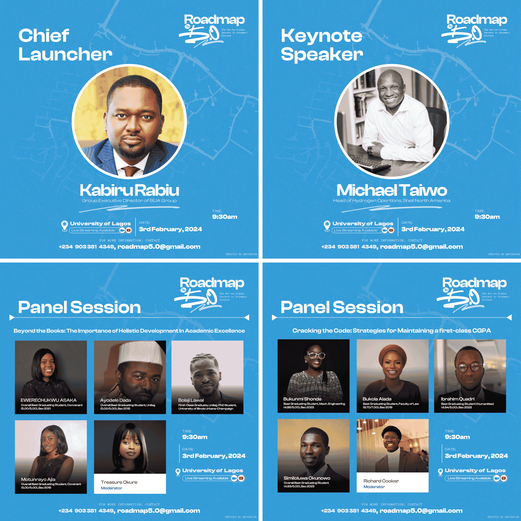
To further establish a personal connection with the audience, professional portraits of the author, keynote speakers, and panelists were incorporated across materials. Minimalist line elements, arrows, and event icons (calendar, clock, location pin) added a functional yet creative touch, reinforcing the concept of a "roadmap" and guidance.
Visual Design Elements
A key focus of the branding was the choice of typography. We selected modern sans-serif fonts for headings and body text to ensure readability and professionalism. Key information, such as event titles and speaker names, was highlighted using bold fonts to draw attention effectively.
The color palette played an essential role in setting the tone of the branding. Blue tones were chosen as the primary color to convey trust, intelligence, and calmness. These were complemented by white accents, which added clarity and simplicity, along with subtle gradients to introduce depth and visual interest.
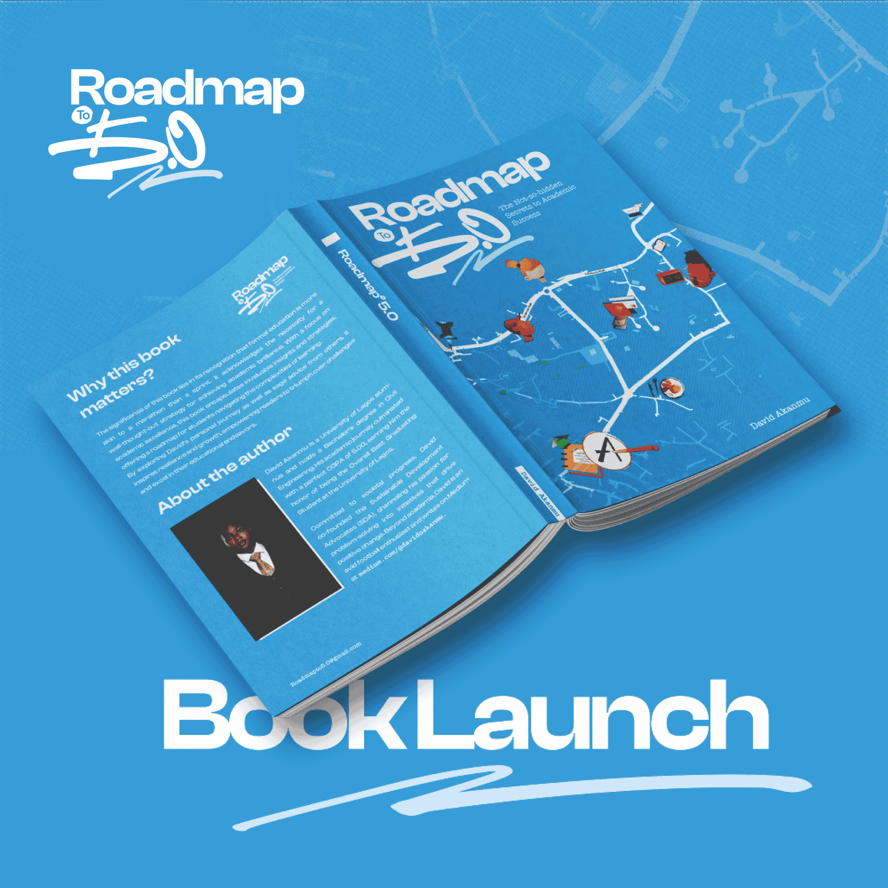
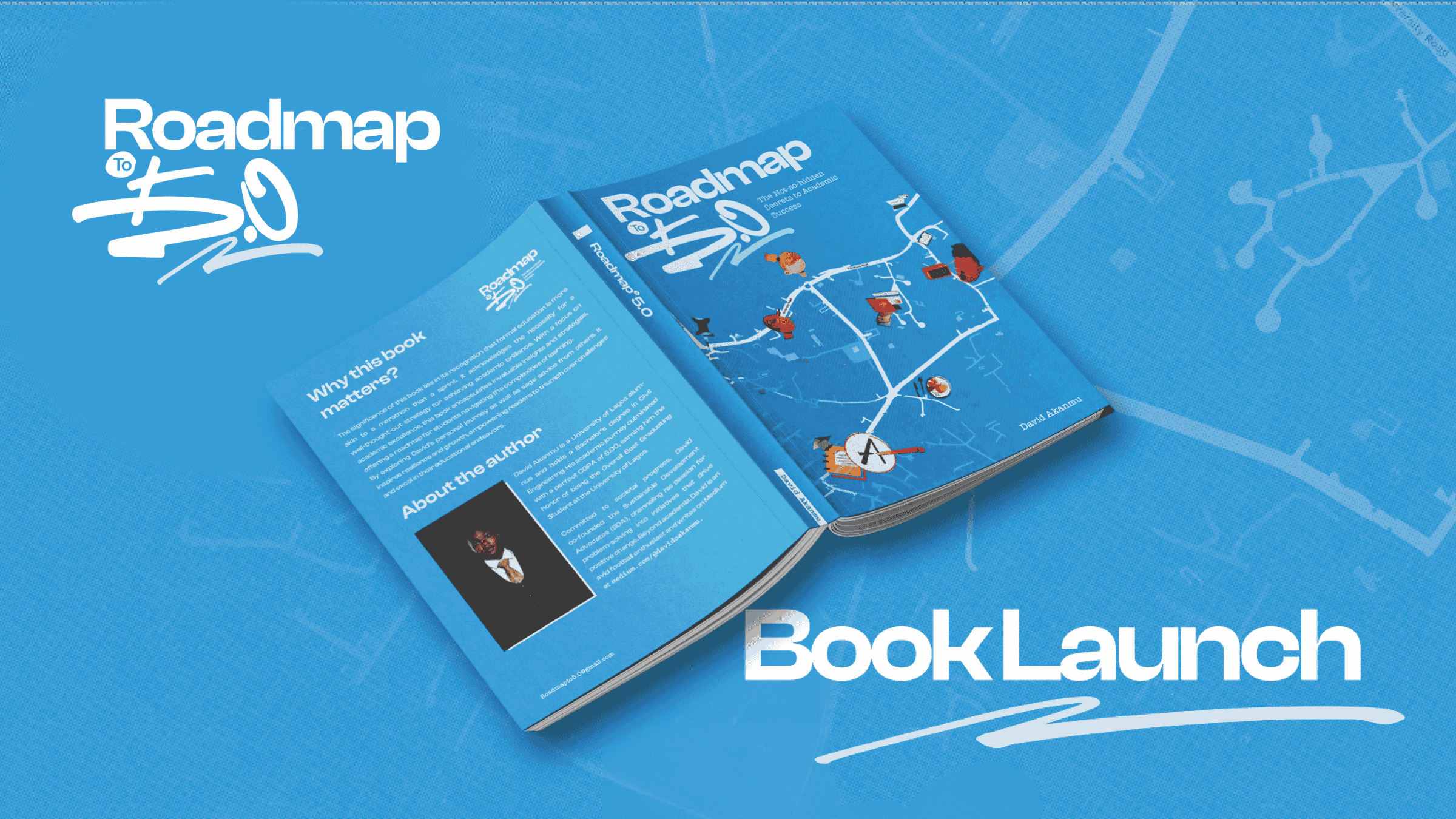
Imagery was another vital component. Professional portraits of the author, keynote speakers, and panelists were used to establish a personal and relatable connection with the audience. Additionally, a custom map graphic was designed for the book cover to symbolize strategic navigation, aligning perfectly with the book's theme. Other features included minimalist line elements and arrows to reinforce the concept of a "roadmap" and guidance, as well as event icons like a calendar, clock, and location pin for quick and clear visual communication of event details.
Deliverables
The project involved the creation of a variety of deliverables to support the event’s promotion and branding. Event flyers and posters were designed to be visually engaging and adaptable for both digital and print use. These incorporated essential event details, professional portraits, and the official logo to maintain consistency.
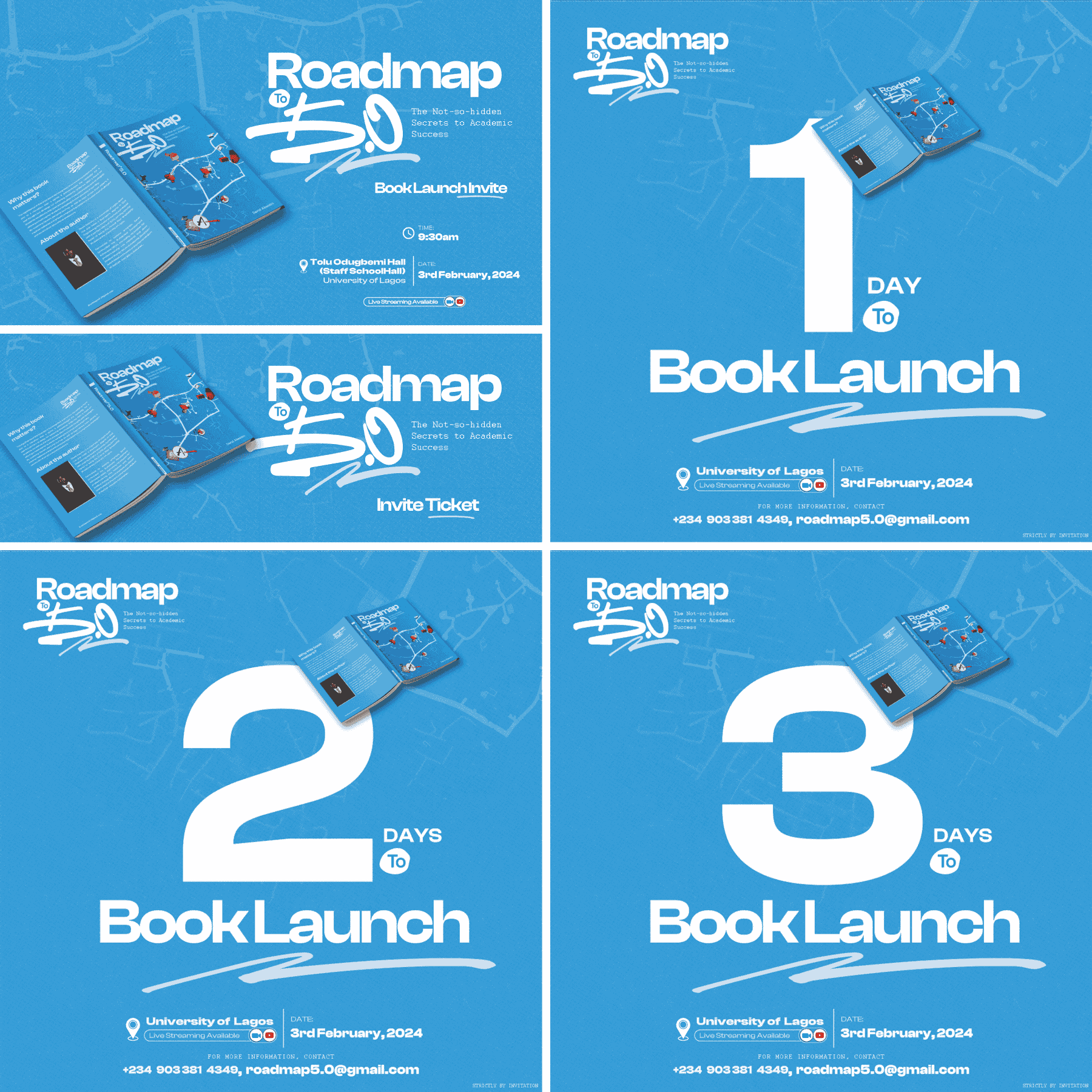
For social media promotion, we developed templates optimized for platforms such as Instagram, Twitter, and Facebook. These templates were versatile, ensuring adaptability for various promotional content.
The book design was another significant aspect. We collaborated on the book cover, which prominently displayed the "Roadmap to 5.0" logo and theme. The interior pages were designed for consistency, including sections for the author’s bio, the book's purpose, and inspirational visuals to engage readers.
Conclusion
In conclusion, the "Roadmap to 5.0" project was a collaborative effort that relied on client feedback and an iterative design process to achieve its goals. Through careful refinements, we ensured the clarity of event details and the prominence of the book’s branding across all materials. The final deliverables, supported by comprehensive branding guidelines, were effective across digital and print platforms. By addressing last-minute needs and maintaining consistency, we successfully delivered impactful branding that captured the essence of the project and contributed to a memorable, inspiring event.