Ecopulse
This project entailed a full-scale rebranding of Ecopulse Technologies Limited, a company in the renewable energy sector.
Redesigning the company’s identity system, creating brand materials, developing social media assets, and establishing brand guidelines. Crafting a modern, cohesive, and professional brand that resonates with its audience while reflecting Ecopulse’s commitments.
Research & Strategy
The project began with extensive research and strategy development. The objective was to reposition Ecopulse as a reliable and innovative provider of renewable energy solutions. A thorough industry analysis helped identify trends in the energy sector, which informed the design approach and visual language. Ecopulse's brand personality was defined as innovative, approachable, and eco-conscious, targeting homeowners, corporate clients, and environmentally conscious individuals.
Brand Assets
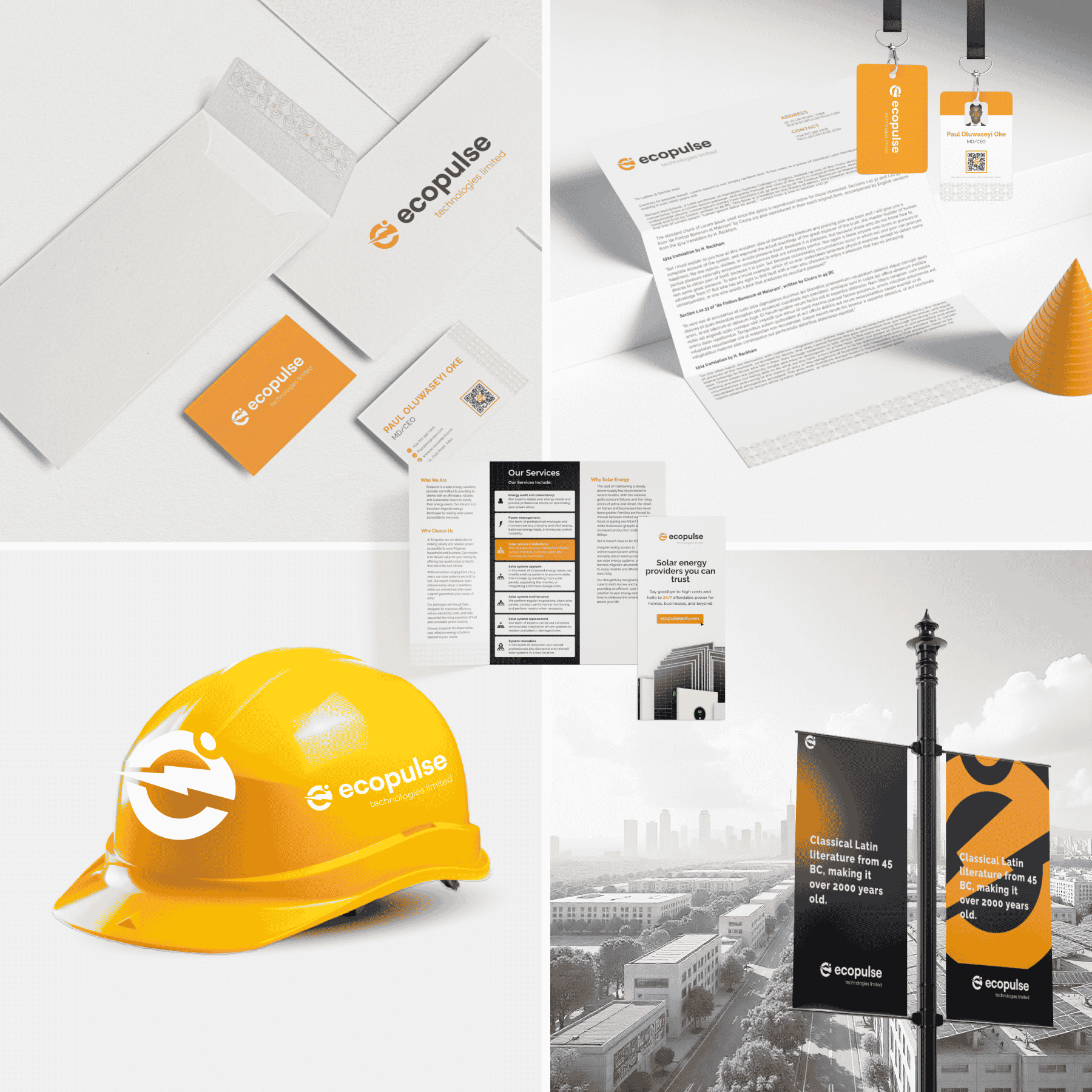
The rebranding also involved the creation of various brand assets. A unique geometric pattern inspired by solar panels and energy grids was developed to provide a visually distinctive identity. Stationery items, including business cards, letterheads, and envelopes, were designed with clean layouts that integrated the logo and brand pattern seamlessly. Marketing materials, such as flyers and brochures, were designed to present Ecopulse's services in a visually appealing and informative manner. Additionally, bold and impactful billboards were created to enhance visibility and brand awareness.
Social Media Materials
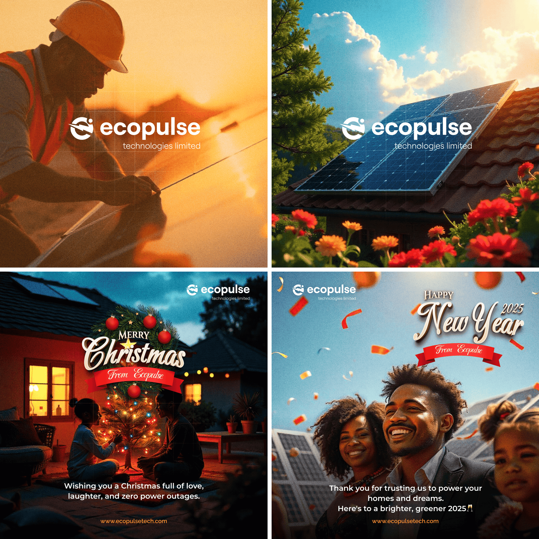
A series of promotional social media assets were designed to engage and resonate with the target audience. These included holiday greetings and customer appreciation posts, featuring high-quality imagery of solar panels and families to emphasize Ecopulse's customer-centric approach. Taglines like "Powering your homes and dreams" highlighted the brand's core message of clean energy and reliability. Consistent use of brand colors and typography ensured a cohesive visual identity across all platforms.
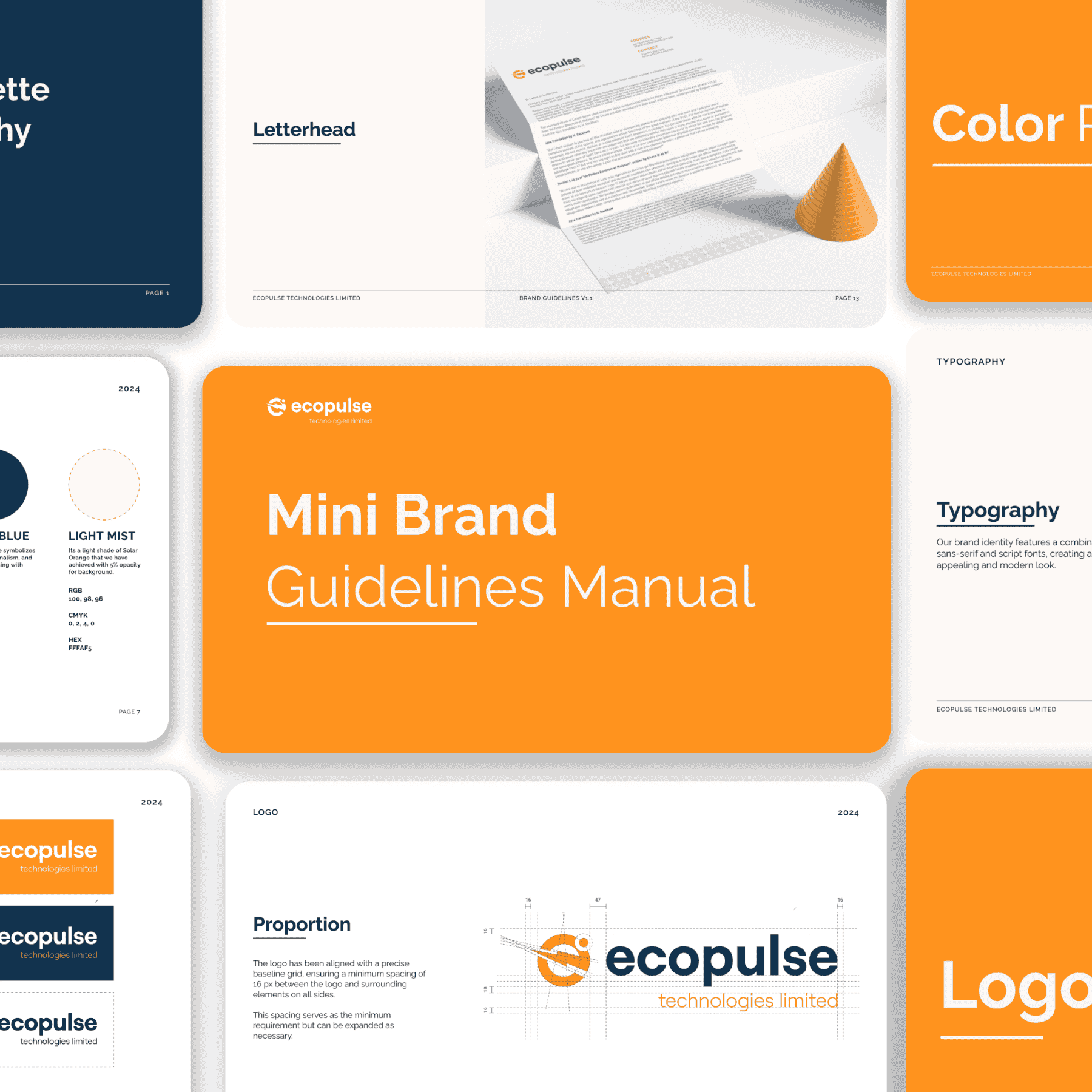
Brand Guidelines Manual
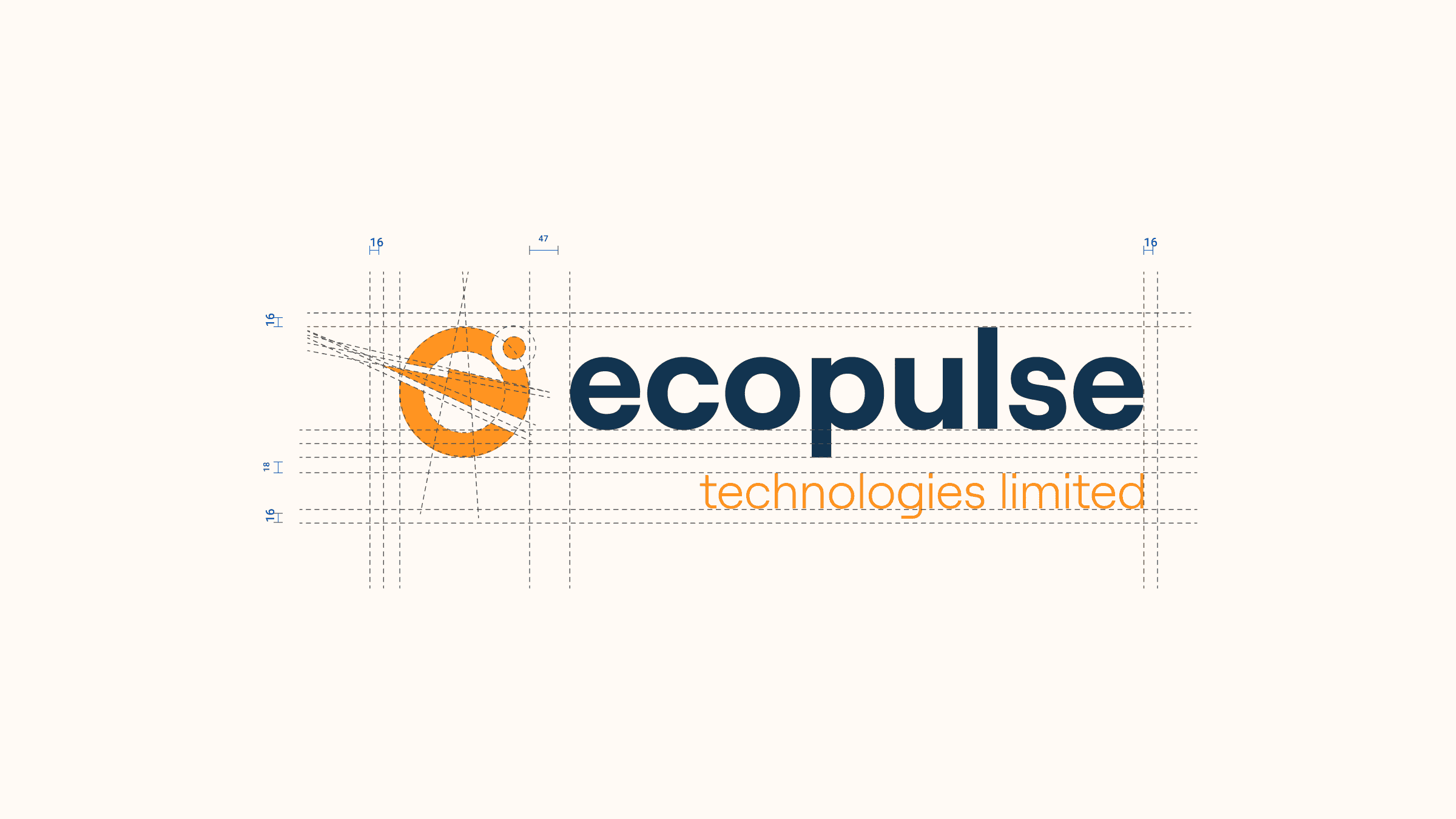
A comprehensive brand guidelines manual was developed to ensure consistency across all touchpoints. This included specifications for typography, such as font hierarchy for headlines, subheadings, and body text. The color palette was clearly defined with RGB, HEX, and CMYK codes to maintain accuracy in digital and print media. Guidelines for logo usage provided clear instructions on placement, sizing, and color variations, along with minimum spacing requirements to preserve visual integrity. Examples of logo and brand asset applications were included to demonstrate usage across signage, packaging, and digital banners.
Results
The rebranding successfully transformed Ecopulse's identity into a modern and professional brand that aligns with its mission and vision. The refreshed logo and cohesive brand assets enhanced visual consistency across all materials. Social media engagement improved due to the thoughtfully designed assets, and the brand's message of sustainability and innovation resonated more strongly with its target audience.
Conclusion
The Ecopulse rebranding project highlights my ability to execute a comprehensive rebranding process, combining strategy, design, and implementation. It demonstrates my expertise in creating cohesive and visually impactful brand systems that effectively communicate a company’s values and resonate with its audience.